<!DOCTYPE html>
<!-- saved from url=(0113)https://images.discover.frost.com/Web/FrostSullivan/%7Bca0df8c3-f468-4f81-85f5-aa5f2fadf25a%7D_LPATSB1_Apr21.html -->
<html class="js-focus-visible" data-js-focus-visible=""><head><meta http-equiv="Content-Type" content="text/html; charset=UTF-8">
<meta name="robots" content="noindex, nofollow">
  
  <meta name="viewport" content="width=device-width, initial-scale=1">
  <link rel="stylesheet" href="https://maxcdn.bootstrapcdn.com/bootstrap/4.5.0/css/bootstrap.min.css">
  <script src="https://ajax.googleapis.com/ajax/libs/jquery/3.5.1/jquery.min.js"></script>
  <script src="https://cdnjs.cloudflare.com/ajax/libs/popper.js/1.16.0/umd/popper.min.js"></script>
  <script src="https://maxcdn.bootstrapcdn.com/bootstrap/4.5.0/js/bootstrap.min.js"></script>


	  <link type="text/css"   href="https://fonts.googleapis.com/css?family=Open+Sans:300,400,400i,600,700|Raleway:300,400,400i,500,500i,700,800,900" rel="stylesheet">
	
      <link href="https://cdnjs.cloudflare.com/ajax/libs/font-awesome/4.7.0/css/font-awesome.min.css" rel="stylesheet">
      <!-- Main Stylesheet File -->
     <link type="text/css" href="https://insights.frost.com/hubfs/Content%20Uploads/DGT/2020/CSS/%7B0b6cd9ab-a661-4acd-bc5d-ea9105630e7f%7D_style.css" rel="stylesheet">


      <!-- Responsive Stylesheet File -->
      <link type="text/css" href="https://insights.frost.com/responsive.css" rel="stylesheet">
	  
      <link type="text/css" href="https://insights.frost.com/animate.min.css" rel="stylesheet">
	  <link rel="stylesheet" href="https://www.w3schools.com/w3css/4/w3.css">
	  <link href="https://insights.frost.com/hubfs/Content%20Uploads/assets/jQuery/%7B649be6d1-8ea6-404a-b604-37c1fd76b263%7D_GCNLP_May19.css" type="text/css" rel="stylesheet">  
	  
      <script src="https://code.jquery.com/jquery-1.9.1.js"></script>
	
	<script src="https://malsup.github.io/jquery.blockUI.js"></script>
	
	
	<script type="text/javascript">

var showmore = false;
var jsq = $.noConflict();
function imgprv()
{
    sw = $(document).width();
    sh = $(window).height();
    jsq.blockUI({css: { backgroundColor: '#000', color: '#fff', top:0, left:0, width:'100%'}, message: '<div onclick="jsq.unblockUI();" style="margin:0 auto; width:100%; height:'+sh+'px; overflow:auto;"><img onclick="jsq.unblockUI();" onContextMenu="return false;" style="-webkit-user-select: none; -khtml-user-select: none; -moz-user-select: none; -o-user-select: none; user-select: none; padding-top:20px" onDragStart="return false" class="liquid1"; src="https://websphere-prod85-1.frost.com/prod/servlet/cio/K56D-01-00-00-00/$INFOGRAPHIC?utm_source=newsletters&utm_medium=email&utm_campaign=genjul21&utm_term=GENSB6I&utm_content=GENSB6I" onContextMenu="return false;" onDragStart="return false" /> <p style="position:fixed; top:20px; right:20px; line-height:20px; background-colour:rgba(0,0,0,0.5); color:white; text-align:left; font-weight:bold; font-size:44px; max-width:50%px">X</p></div>'});
}

</script>


	<style>
		
	
	@media screen and (min-width: 1000px)
{
    #page-wrap { min-width:100% !important; }
}

@media only screen and (max-width: 540px)
{
    #page-wrap { min-width:540px; }
    .PageUL { display:inline-block; }
    .PageUL li { width:100%; }
    body{ padding-top:0px; }
    .FormUL { margin-top:20px; }
    
 .liquid
{
    height: auto;
    width:100% !important;
    max-width:100% !important;
    
}


}
	</style>


 <style>
	 @media (min-width: 576px){
.col-sm-7 {
    -ms-flex: 0 0 58.333333%;
    flex: 0 0 58.333333%;
    max-width: 100% !important;
}
	 }
	 @media (min-width: 768px){
.col-sm-7 {
    width: 100% !important;
}}
         @media (max-width:770px) {
         .slider-area{
         height:280px;
         }
         .niceties.preview-2,.nivoSlider{
         height:100%;
         }
         }
         @media (min-width:720px) and (max-width:920px){
         .slider-area{
         height:400px;
         }
         .niceties.preview-2,.nivoSlider{
         height:100%;
         }
         }
         @media  (min-width: 1400px){
         .slider-content {
         padding: 280px 0!important;
         }
         }
         @media (min-width:1000px) {
         .form-popup{
         left:35%  !important;
         }
         }
         @media (min-width:701px) and (max-width:1000px) {
         .form-popup{
         left:35% !important;
         }
         }
         @media (max-width:700px) {
         .form-popup{
         left:10% !important;
         }
         }
         .form-popup{
         height:500px;
         top:2%
         }
         .owl-dots {display: none !important}
         .owl-dot {display: none !important}
         .fa {
         padding: 10px !important;
         color: #fff;
         }
         * {box-sizing: border-box;}
         /* Button used to open the contact form - fixed at the bottom of the page */
         .open-button {
         background-color: #555;
         color: white;
         padding: 5px 2px;
         border: none;
         cursor: pointer;
         opacity: 0.8;
         bottom: 10px;
         left: 18px;
         min-width: 100px;
         }
         /* The popup form - hidden by default */
         .form-popup {
         display: none;
         position: fixed;
         bottom: 0;
         left: 50%;
         border: 3px solid #f1f1f1;
         z-index: 9;
         background-color: #fff;
         }
         /* Add styles to the form container */
         .form-container {
         max-width: 260px;
         padding: 10px;
         background-color: white;
         height: auto
         }
         /* Full-width input fields */
         .form-container input[type=text], .form-container input[type=password] {
         width: 100%;
         padding: 15px;
         margin: 5px 0 22px 0;
         border: none;
         background: #f1f1f1;
         }
         /* When the inputs get focus, do something */
         .form-container input[type=text]:focus, .form-container input[type=password]:focus {
         background-color: #ddd;
         outline: none;
         }
         /* Set a style for the submit/login button */
         .form-container .btn {
         background-color: #4CAF50;
         color: white;
         padding: 16px 20px;
         border: none;
         cursor: pointer;
         width: 100%;
         margin-bottom:10px;
         opacity: 0.8;
         }
         /* Add a red background color to the cancel button */
         .form-container .cancel {
         background-color: red;
         }
         /* Add some hover effects to buttons */
         .form-container .btn:hover, .open-button:hover {
         opacity: 1;
         }
		 .btn-primary {
  color: #fff;
  background-color: #00a1e0;
}
      </style>
	
	
	<style type="text/css">
    
@media (min-width: 768px){
.col-sm-3 {
    width: 32% !important;
}
}


.padd_20 {
	padding-bottom:40px;	
}

.padd_40 {
	padding-bottom:40px;	
}
		
		.cont_lt {
			background-color: #ffffff;
			padding: 20px;10px;
			margin-top: 40px
		}
		.cont_rt {
			background-color: #0170c1;
			padding:10px 5px 10px 5px;
			color: #ffffff;
			font-family: Segoe, "Segoe UI", "DejaVu Sans", "Trebuchet MS", Verdana, "sans-serif";
			line-height: 18px;
			font-size: 13px;
			font-variant: normal;
		}
		.cont_rt_top {
			background-color: #92d051;
			padding: 10px 10px;
			color: #ffffff;
			font-family: Segoe, "Segoe UI", "DejaVu Sans", "Trebuchet MS", Verdana, "sans-serif";
			font-size: 18px;
			font-weight:bold;
			text-align: left;
			margin-top: 40px
		}
		
		.arrow-down {
		  width: 0; 
		  height: 0; 
		  border-left: 20px solid transparent;
		  border-right: 20px solid transparent;
		  border-top: 20px solid #92d051;
		  position: absolute;
			margin-left: 30px;
		}
		
	.social {
	color:#ffffff;
	background-color: #333333;
	font-family: Segoe, "Segoe UI", "DejaVu Sans", "Trebuchet MS", Verdana, "sans-serif";
	font-size: 16px;
	text-align:center;
	padding: 10px 0px;
	vertical-align: middle;
}
		.social a img {
			vertical-align: middle;
		}


</style>
	
	
	  <style type="text/css">
@font-face {
  font-weight: 400;
  font-style:  normal;
  font-family: 'Circular-Loom';

  src: url('https://cdn.loom.com/assets/fonts/circular/CircularXXWeb-Book-cd7d2bcec649b1243839a15d5eb8f0a3.woff2') format('woff2');
}

@font-face {
  font-weight: 500;
  font-style:  normal;
  font-family: 'Circular-Loom';

  src: url('https://cdn.loom.com/assets/fonts/circular/CircularXXWeb-Medium-d74eac43c78bd5852478998ce63dceb3.woff2') format('woff2');
}

@font-face {
  font-weight: 700;
  font-style:  normal;
  font-family: 'Circular-Loom';

  src: url('https://cdn.loom.com/assets/fonts/circular/CircularXXWeb-Bold-83b8ceaf77f49c7cffa44107561909e4.woff2') format('woff2');
}

@font-face {
  font-weight: 900;
  font-style:  normal;
  font-family: 'Circular-Loom';

  src: url('https://cdn.loom.com/assets/fonts/circular/CircularXXWeb-Black-bf067ecb8aa777ceb6df7d72226febca.woff2') format('woff2');
}</style></head><body><div id="gcnform" class="form-popup">
         <a type="button" class="close" onclick="closeForm()">X</a>
         <iframe name="ifrm" id="ifrm" src="https://insights.frost.com/Newsletters" style="border:0; background-color: #fff; min-height: 500px; max-width: 350px;" target="_blank"></iframe>
      </div>
      <script>
         function loadIframe(iframeName, url) {
         	document.getElementById("gcnform").style.display = "block";
            var $iframe = $('#' + iframeName);
            if ( $iframe.length ) {
                $iframe.attr('src',url);   
                return false;
            }
            return true;
         }


         function openForm() {
          document.getElementById("gcnform").style.display = "block";
         
         }
         
         function closeForm() {
          document.getElementById("gcnform").style.display = "none";
         }
      </script>
      
       <script>     
         (function(i,s,o,g,r,a,m){i['GoogleAnalyticsObject']=r;i[r]=i[r]||function(){ 
         (i[r].q=i[r].q||[]).push(arguments)},i[r].l=1*new Date();a=s.createElement(o), 
         m=s.getElementsByTagName(o)[0];a.async=1;a.src=g;m.parentNode.insertBefore(a,m) 
         })(window,document,'script','//www.google-analytics.com/analytics.js','ga'); 
         
         ga('create', 'UA-55185725-1', 'auto'); 
         ga('send', 'pageview'); 
         
      </script> 


<table id="IFrameMasterTable" border="0" align="center" cellpadding="0" cellspacing="0" style="font-family: &#39;Open Sans&#39;, sans-serif; padding: 10px; width:100%; ">
    <tbody><tr>
            <td valign="top">
                <table width="100%" border="0" align="center" cellpadding="0" cellspacing="0">
                <tbody><tr>
                    <td class="PageHeader2" style="width: 100%;">
                        

                    <table width="100%" border="0" align="center" cellpadding="0" cellspacing="0">
                        <tbody><tr>
                            <td class="PageHeader2" style="width: 100%;">
                                    
<div>
<div>

<ul class="PageSections_4PartWithBanner1" style="padding: 8px;">


<li class="PageSection_LIP" style="font-family:&#39;Open Sans&#39;, sans-serif !important; width:100% !important">
	<div style="font-weight: bold; margin-top: -10px; color:rgb(23,66,107); font-size: 22px; margin-bottom: 5px; font-family:font-family:&#39;Open Sans&#39;, sans-serif !important; text-align: center ">IoT-Based Technologies and Patient Preference Propel Growth Prospects for Global Home Healthcare Solutions</div>
    <div style="font-style: italic; margin: 10px 0px 0px 0px; font-size: 14px !important; text-align: center">Future growth potential to be accelerated by reforms in payment and reimbursement policies</div>

	
	<div class="col-sm-7 cont_lt" style=" margin-top: 0px; padding-top: 0px;"><br>
 
  <div style=" font-family: Segoe, &#39;Segoe UI&#39;, &#39;DejaVu Sans&#39;, &#39;Trebuchet MS&#39;, Verdana, &#39;sans-serif&#39;; font-size: 16px; font-weight: normal; padding-top: 0px; margin-top: 0px; padding-right: 3px;  line-height: 1.8EM;" id="image">	
	  <p style="text-align:left; margin-top:10px; font-weight: bold"><em><font style="color:#991B1E">
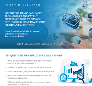
Click image to view it in full size</font></em></p>
  <img src="https://insights.frost.com/hubfs/GIL%20Community%20Newsletter%20-%2030789/2021/July/TH/Images/Home%20Healthcare%20Solutions.png" width="300" height="282" alt="" class="liquid" style="float: left; margin: 0px 20px 0px 0px; line-height:10px; padding:3px; border: 1px solid #000000" onclick="imgprv()">
 
</div>


<p style=" font-family: Segoe, &#39;Segoe UI&#39;, &#39;DejaVu Sans&#39;, &#39;Trebuchet MS&#39;, Verdana, &#39;sans-serif&#39;; font-size: 15px; font-weight: normal; padding-top: 0px; margin-top: 0px; padding-right: 3px;  line-height: 1.8EM; text-align:justify">As per medicare.gov, home healthcare is defined as a wide range of healthcare services that can be given at home for an illness or injury. Home healthcare is usually less expensive, more convenient, and just as effective as the care provided in a hospital or Skilled Nursing Facility (SNF). Presently, home healthcare has evolved to also cater to preventive and proactive care. The most important value offered by technology-enabled home care is preventing or delaying the patient’s shift to acute or long-term-care settings. Technology holds a central role in expanding the market for home healthcare. It has come a long way from infrastructure and equipment consisting of durable medical products to technologies consisting of sensors, communication technology, Big Data, and AI. The study focuses on market for advanced data-based technologies. The main objective of technology-enabled home care could vary for developing and developed countries. For developing countries, it may be linked to improving the accessibility of care, while for the developed countries the main objective probably focused on reducing the overall healthcare cost. The current study focuses on the developed markets of the US and Western Europe (Germany, France, Italy, Spain, and UK).</p><p>
</p></div>
 
    </li>
	
	<li class="PageSection_LIP" style="font-family:&#39;Open Sans&#39;, sans-serif !important; width:100% !important"><div>
		<div align="center"> 
       <div style="display: inline-block; margin: 4px"><a class="ready-btn page-scroll" href="https://store.frost.com/internet-of-things-iot-based-technologies-and-patient-preference-to-drive-growth-of-the-global-home-healthcare-solutions-market-2025.html?utm_source=newsletters&utm_medium=email&utm_campaign=genjul21&utm_term=GENSB6T&utm_content=GENSB6T" target="_blank" style="margin-top:11px">Table of Contents</a></div>
       <div style="display: inline-block">
  
                        </div>
						
						<div style="display: inline-block">
		  <a class="req-btn page-scroll" href="https://insights.frost.com/Newsletters?gon_qs=GENSB6RS" onclick="return loadIframe('ifrm', this.href);">Request Sample</a>
		  </div> 
		  
		</div>  

<div class="AccordionGroupHeader" style="margin-left: 0px; padding-left:0px;width: 80%; margin-top: 10px">GROWTH PIPELINE DIALOG™</div>
 <p style="text-align: left; margin: 5px 5px 10px 0px; margin-left: 0px">Take your first step towards achieving growth-centric solutions with our
 <a href="https://hub.frost.com/gpdialog/?utm_source=newsletters&utm_medium=email&utm_campaign=genjul21&utm_term=GPD&utm_content=GPD" target="_blank" >Growth Pipeline Dialog™</a>. Speak to our industry experts in a complimentary open discussion that will spark innovative thinking and growth opportunities that will benefit your organization. </p>

		<p></p>

<div class="AccordionGroupHeader" style="width: 80%; margin-top: 10px">HAVE A SUBSCRIPTION?</div>
<div style="text-align: center; margin: 5px 5px 10px 0px; margin-left: 5px"><strong>Access Research Via</strong> </div>


		<div align="center"> 
       <div style="display: inline-block; margin: 4px"><a class="ready-btn page-scroll" href="https://member.frost.com/login?reportID=K56D-01-00-00-00" target="_blank" data-popuptype="link">Member Portal</a></div>
       <div style="display: inline-block">
  
                        </div>
		
		  <div style="display: inline-block">
  
         <div class="exampleContainer">
                    <div class="exampleLive" style="margin:4px">
                        
                       <a href="https://cds.frost.com/p/297230703?utm_source=newsletters&utm_medium=email&utm_campaign=genjul21&utm_term=GENSB6C&utm_content=GENSB6C#!/ppt/c?id=K56D-01-00-00-00" target="_blank" class=" ready-btn page-scroll"> Client Delivery Portal</a>
                    </div>
                
               
	</div>
		</div>  
	
</div>  

</div></li>


    </ul>
           </div> </div> 
							</td></tr></tbody></table>
					</td></tr></tbody></table>
		
		</td></tr></tbody></table>


 <script src="https://insights.frost.com/hubfs/Testing/jquery.min.js"></script>
    
      <!-- Contact Form JavaScript File -->
      <script src="https://insights.frost.com/hubfs/Testing/main.js"></script>


</body><loom-container id="lo-engage-ext-container"><div></div><loom-shadow classname="resolved"></loom-shadow></loom-container></html>